My Role
I led UI/UX and the design system for Symphony, and built core parts of the Vue front-end.
I owned key areas end-to-end (from flow definition to UI delivery), and also supported enablement with user guides and sales pitch materials when needed.
My responsibilities included
Defining key user journeys, workspace layout, and interaction rules for the analytics experience
Designing core UI patterns and behaviors for complex, data-heavy screens
Creating and maintaining the design system across Figma and front-end (Figma → code)
Defining a reusable analytics workspace framework used across multiple apps
Building reusable UI components in Vue.js with Bootstrap and SCSS
Iterating UX decisions through feedback, usage insights, and technical constraints
Cross-team collaboration
Working with Associate Directors and Directors to clarify requirements, scope, and priorities
Partnering closely with back-end engineers on data-driven features, workflows, and integration constraints
Keeping design and engineering aligned on shared rules, states, and interaction patterns
Supporting internal reviews and client walkthroughs to validate flows and iterate quickly
Running lightweight usability checks and feedback sessions on complex enterprise workflows
Problem
Many enterprise teams use BI tools like Tableau, Power BI, and Qlik, but still struggle to turn insights into shared decisions and client-ready outputs.
The pain is not the analysis itself. It is everything after the insight:
dashboard → screenshot → email → “quick deck” → comments → rework.
Once work leaves the dashboard, context gets lost. Feedback lives in scattered threads, and analysts end up redoing work to answer “quick” follow-ups.
In regulated environments (finance and healthcare) this is even harder: strict compliance, secure sharing, and large volumes of complex data (often including PDF reports) make collaboration slow and risky.
The result is duplicated effort, slower delivery, and analytics work that is difficult to scale across teams.
Constraints & challenges
Regulated environments (finance and healthcare) with strict compliance and security needs
Complex, data-heavy UIs where clarity and performance both mattered
Different user types (analysts, managers, and non-technical stakeholders) needing the same source of truth
Workflows that required review, approval, and auditability (human-in-the-loop)
Solution
Symphony was designed as a collaboration and delivery layer on top of existing analytics.
It did not try to replace BI platforms. Instead, it brought the full workflow into one secure workspace: report setup, analysis, collaboration, and storytelling.
This kept teams in context from start to finish, without exporting screenshots or rebuilding decks.
White-labeling was a core requirement. Symphony needed to work as a BRG-branded product and also as a client-branded platform, using theme tokens and logo swaps without rewriting UI components.
The goal was to design a unified platform that could:
Enable guided, no-code report import and configuration
Provide a shared analysis workspace with filters, annotations, and review
Support collaboration in context (comments, bookmarks, and sharing)
Turn insights into client-ready narratives inside the same product
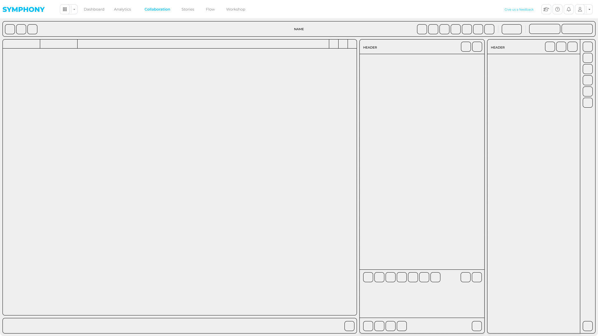
Core Architecture
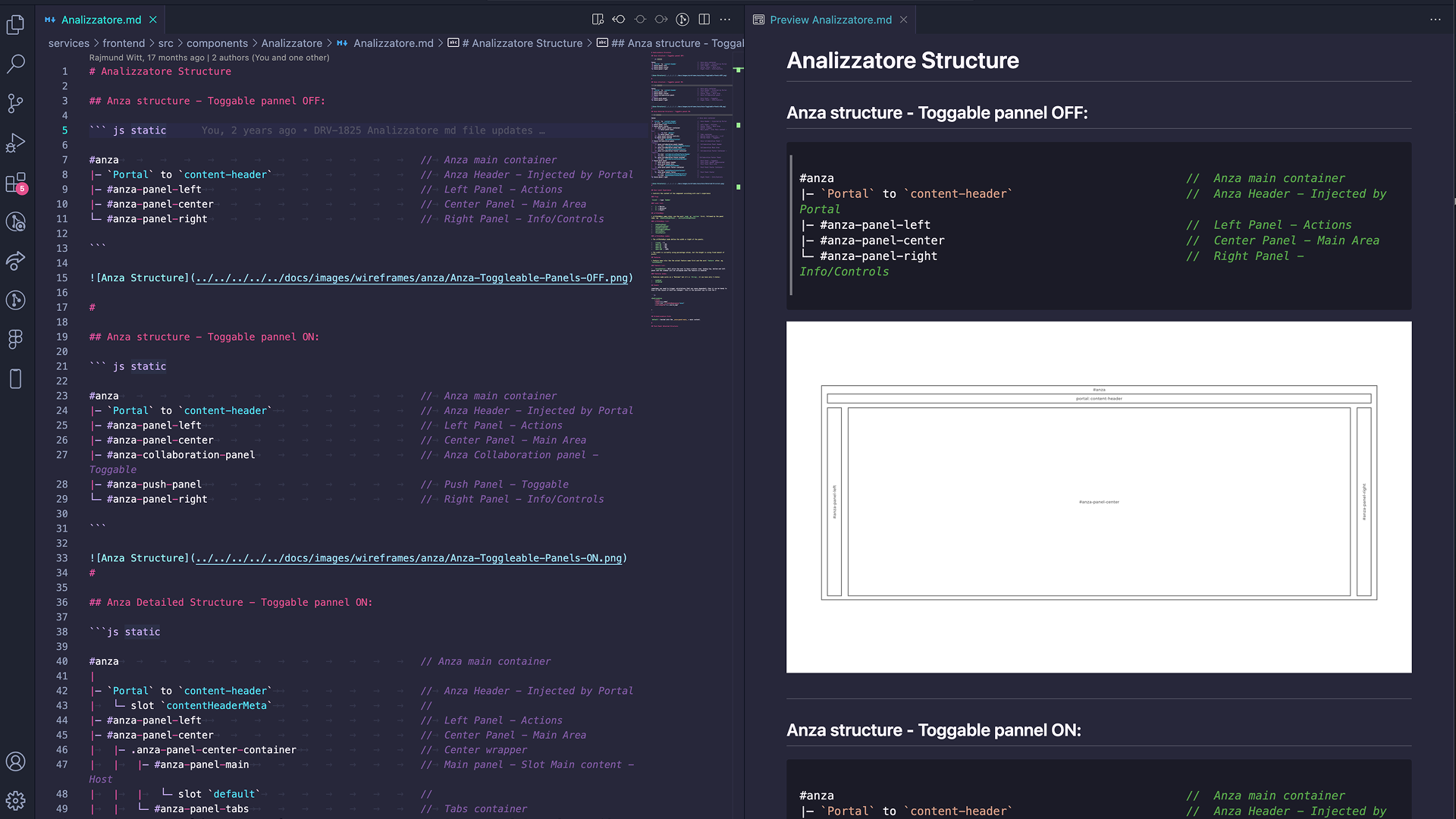
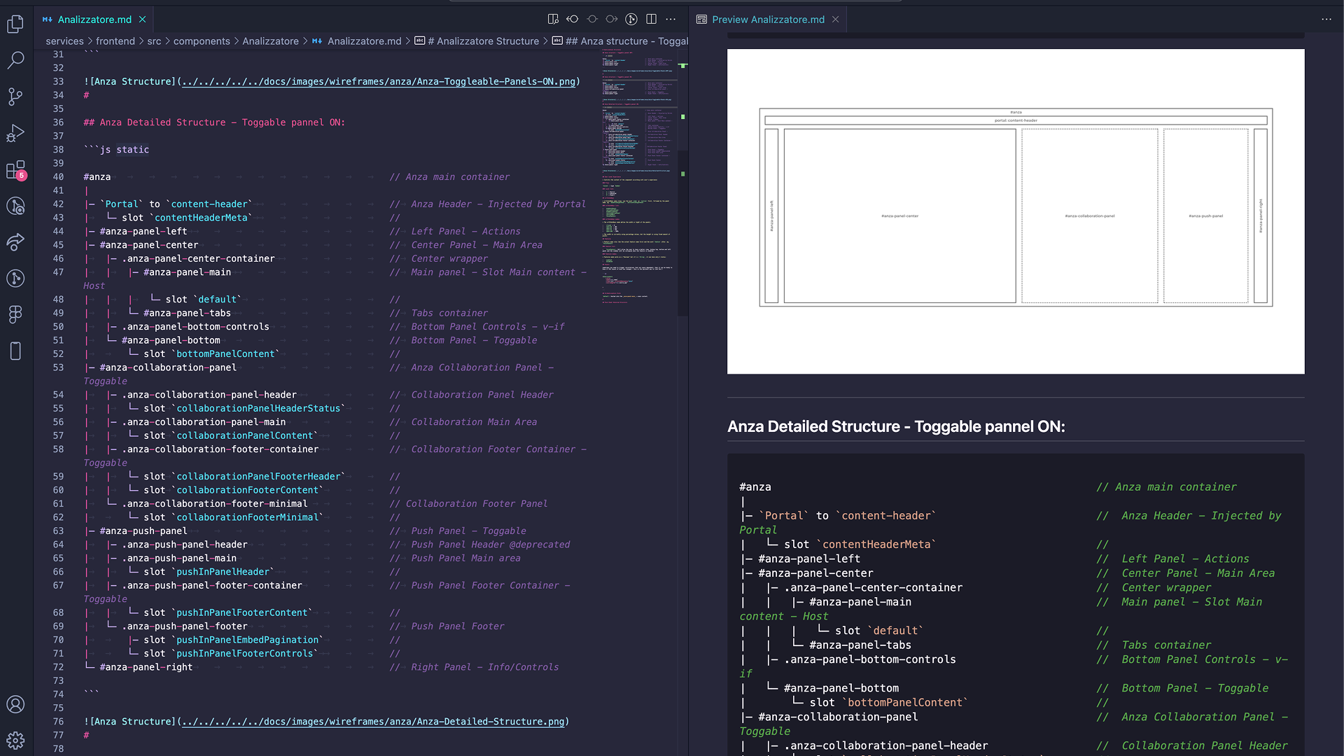
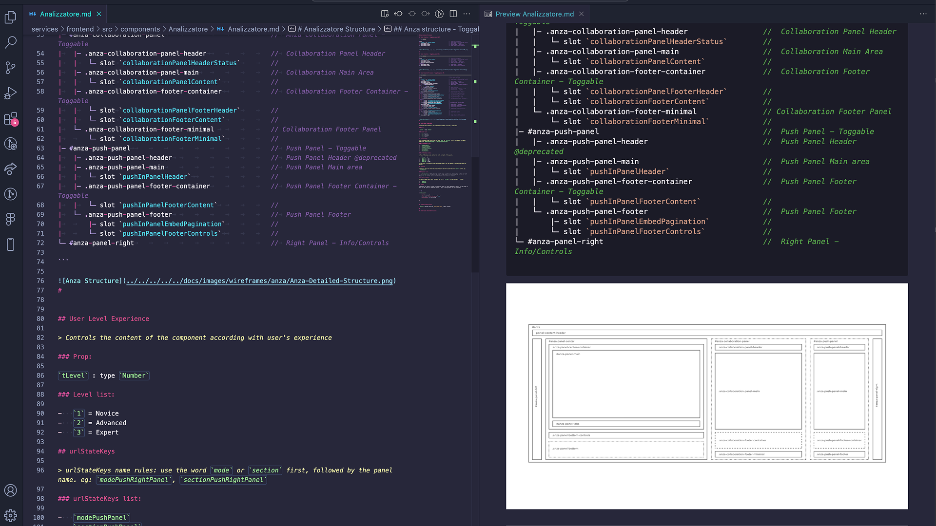
To keep Symphony scalable, I designed the core UI architecture the platform was built on.
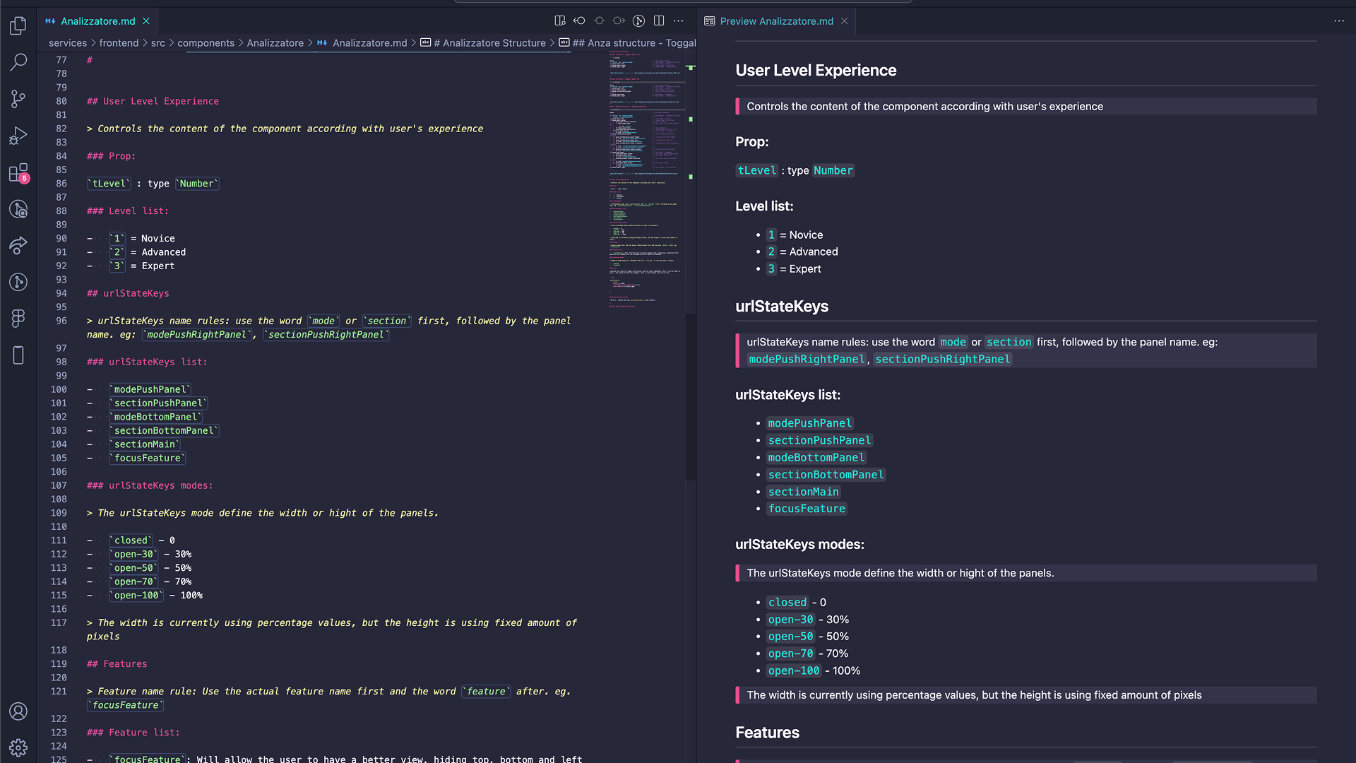
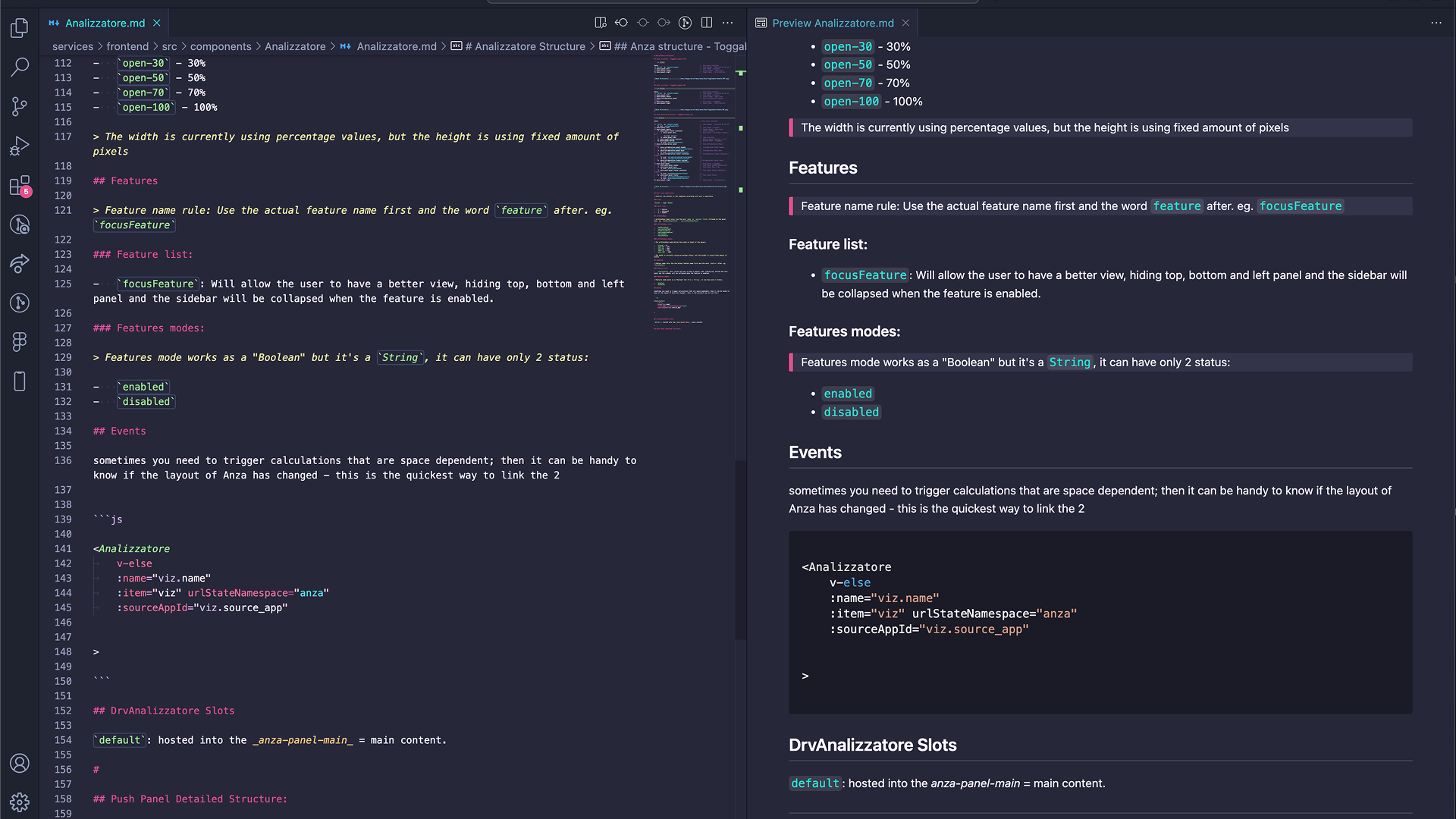
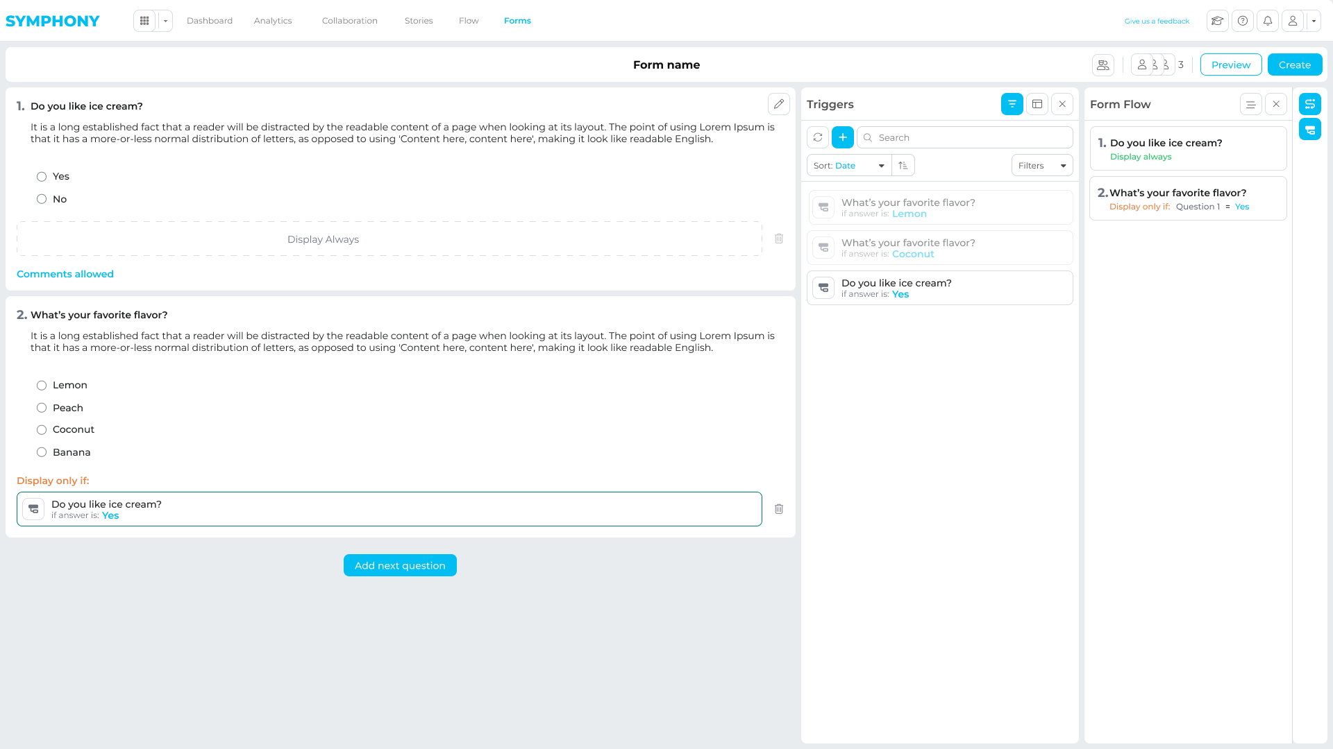
Internally we nicknamed this framework Analizzatore (Italian for “Analyzer”). It defined a reusable analytics workspace that could be reused across different apps by swapping data, tools, and panels, without rebuilding the layout and interaction model every time.
This architecture became the base for Embedded Analytics and later features like bookmarks, workflow states, and specialized tools.
What I defined
A consistent workspace layout system (panels, zones, hierarchy)
Clear responsibilities for each panel and slot-based composition rules
Interaction patterns for filters, charts, drilldowns, and empty/loading states
Principles to scale the UI across new tools, workflows, and data sources
Foundations for roles, permissions, and contextual visibility
Why it mattered
Reduced ambiguity between design and engineering on complex UI behavior
Faster, more consistent front-end delivery across modules
Clear contracts for back-end integration and future expansion
Less rework as new features and apps were added
Design Process
Symphony was designed around the full analytics workflow, not just dashboards.
The focus was on what happens after insights are found: collaboration, validation, iteration, and delivery. The process combined research, system design, and continuous validation to reduce risk before development and keep the platform scalable.
Discovery & Framing
Across finance, healthcare, and professional services, teams consistently left BI tools to collaborate: screenshots, decks, email threads, and rework.
Research and stakeholder sessions showed the real bottleneck was not access to data, but everything that happened after an insight.
Symphony was framed as a collaboration and delivery layer on top of existing BI tools, improving how insights were shared, reviewed, and turned into outcomes.
Roles & Workflows
Instead of demographic personas, the platform was shaped around enterprise roles and responsibilities.
Design decisions were driven by how builders, leaders, and decision-makers interacted with analytics day to day, and how work moved between them.
Analytics Builders
Create and maintain dashboards and data products
Need structured, in-context feedback and validation
Want to reduce ad-hoc requests and screenshot-based iterations
BI & Analytics Leaders
Own analytics strategy, governance, and adoption
Care about ROI, reuse, and platform scalability
Need a consistent delivery layer without building custom portals
Analysts & Decision Makers
Explore data and align with stakeholders
Need collaboration and narrative without losing context
Want faster insight sharing and clearer outputs
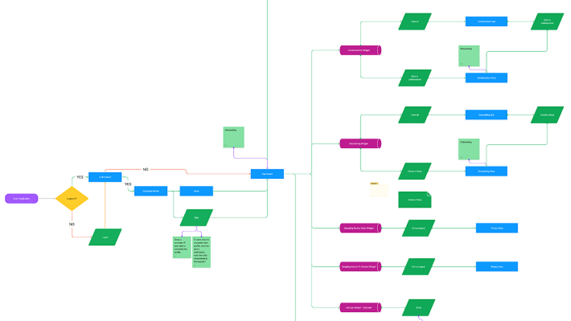
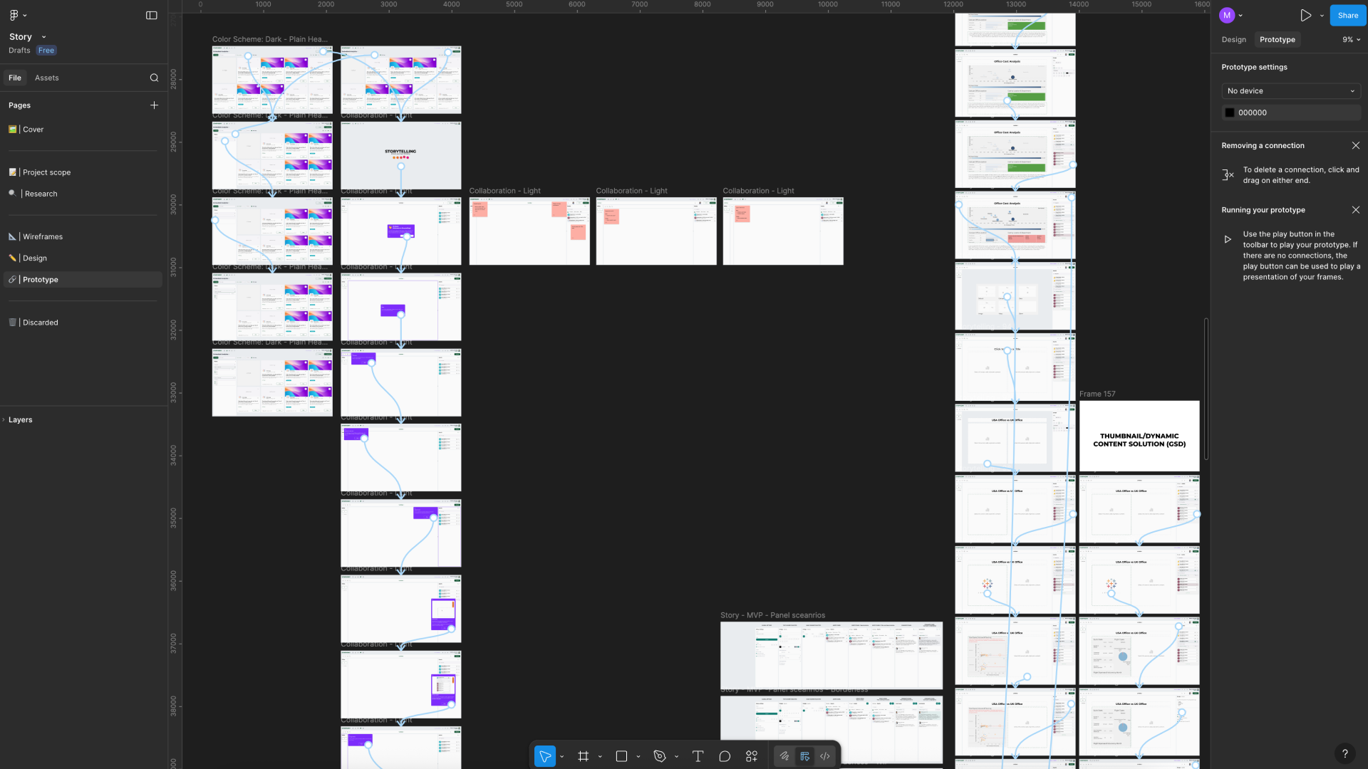
Flow & Wireframes
Because of the platform’s complexity, a large part of the work focused on defining flows, structures, and interaction rules before UI production.
Flows, wireframes, and prototypes were used to align stakeholders, test assumptions, and de-risk development before committing to engineering work.
These artefacts were used to:
- Align design and engineering on complex system behavior
- Validate data-heavy interactions early
- Reduce implementation risk and rework
- Support guided reviews and feedback sessions
Delivery mindset
Symphony was built inside a fast-moving, multidisciplinary product team at BRG (GAT), where delivery pressure and product quality had to coexist.
Throughout the project, I consciously moved between two working modes that shaped both how the team operated and how the product evolved:
Focused on momentum and pragmatism: unblocking the team, shipping MVPs, validating ideas quickly, and turning complex requirements into working systems. This mode was essential to explore the problem space, support pilots, and keep the platform moving forward.
Focused on craft and product quality: refining interactions, hierarchy, spacing, and visual language. This mode shaped how Symphony felt to use, ensuring that a complex enterprise platform remained clear, coherent, and credible for both internal teams and external clients.
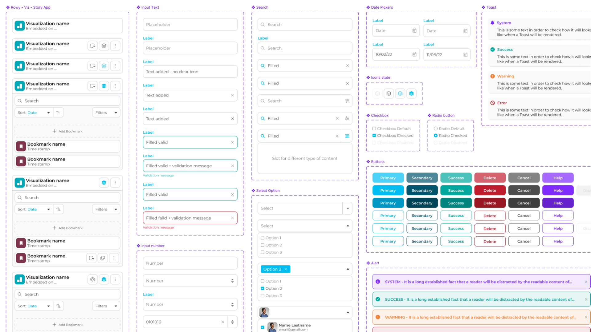
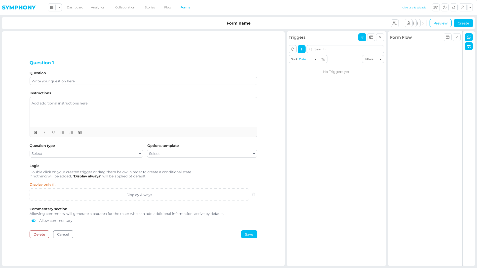
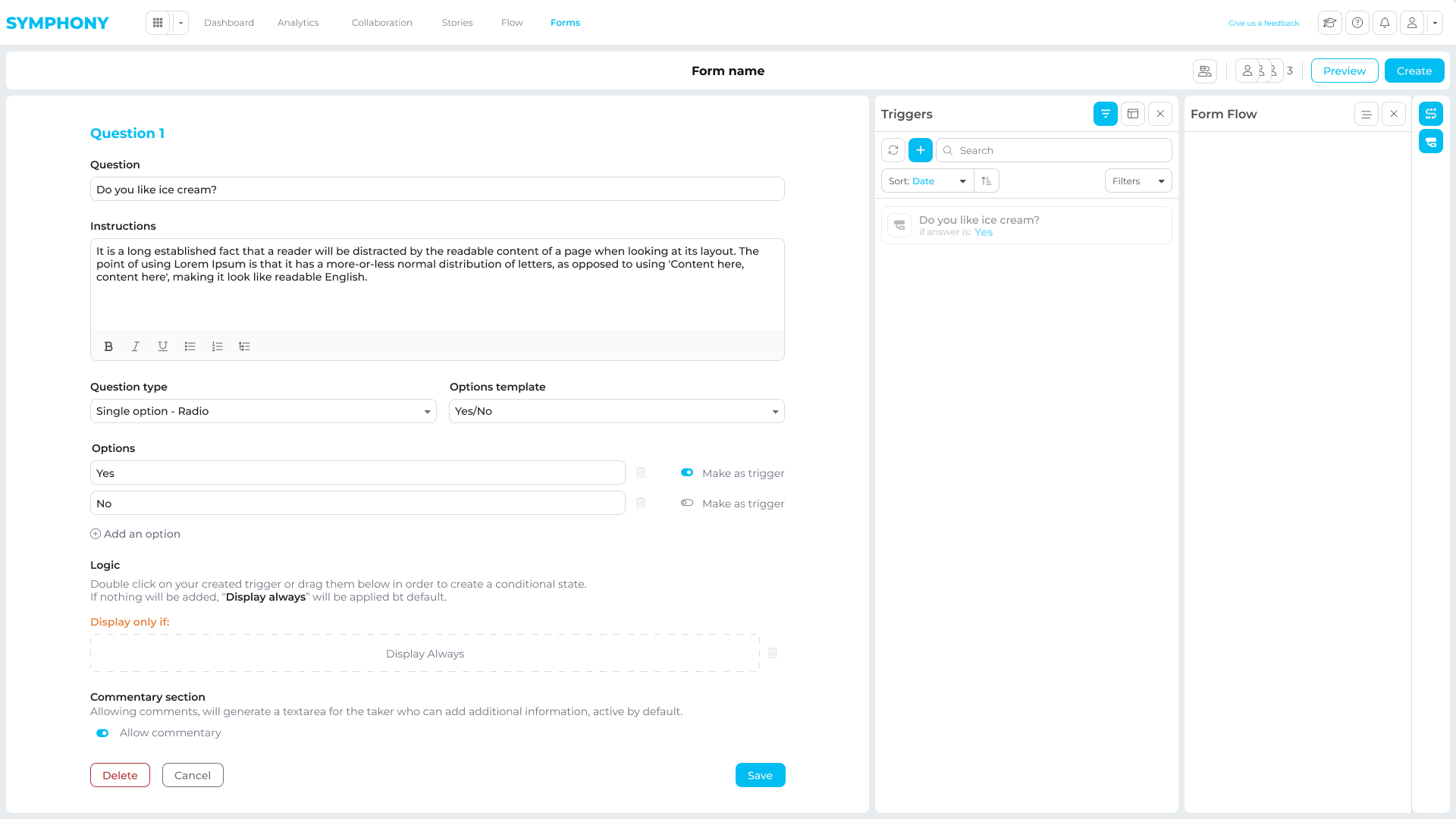
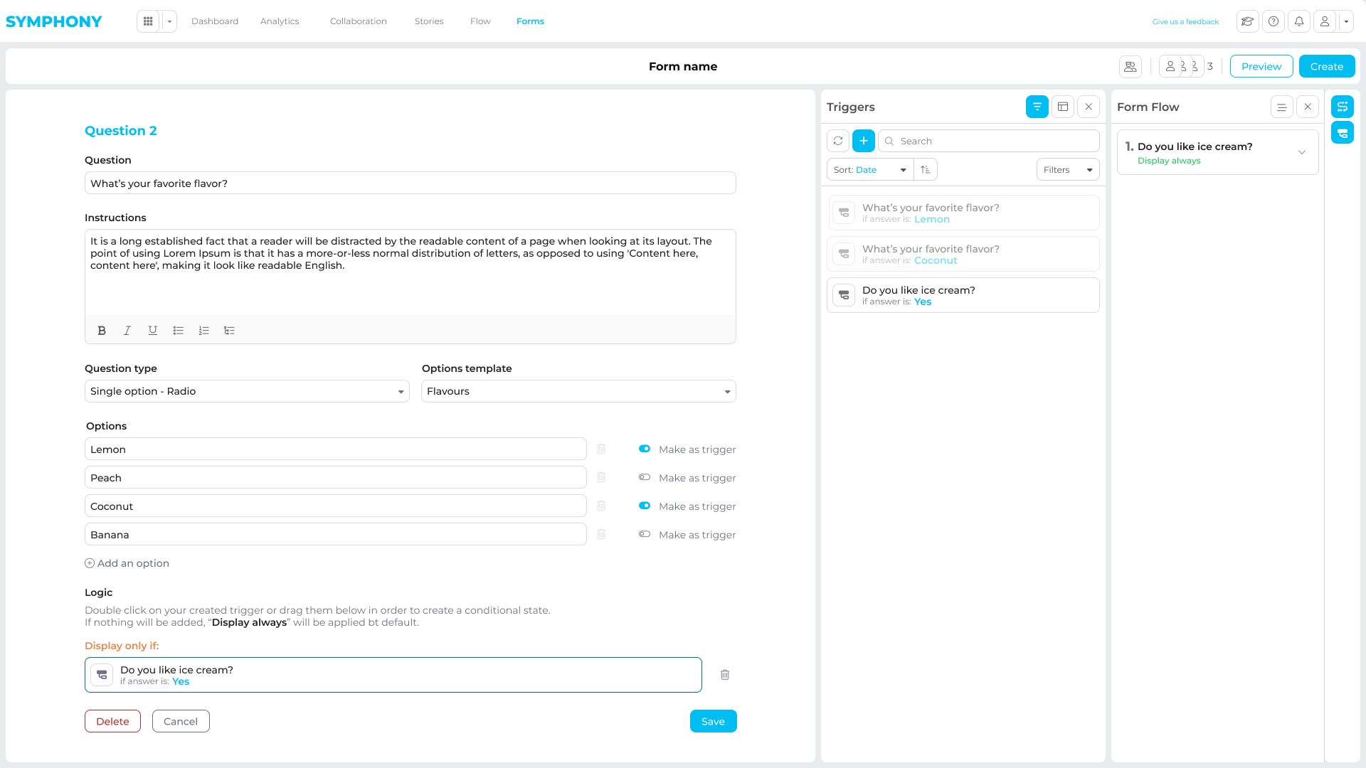
Design System & Prototyping
I built a component-driven design system that stayed aligned between Figma and the product.
Tokens and variables supported consistency, theming, and white-labeling, while reusable components covered common patterns for data-heavy screens.
Prototypes at different fidelities were used to validate key workflows, align with engineering, and gather feedback before committing to production builds.
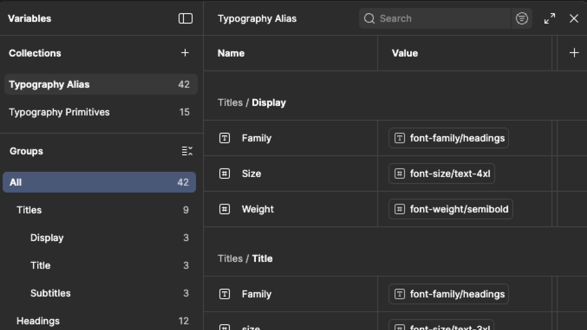
Variables - Alias
Semantic aliases and design tokens that kept typography, colors, spacing, and states consistent across modules, while supporting theming and client branding.
Components
An in-house component library (no off-the-shelf UI kit) covering inputs, filters, states, and feedback patterns. This reduced UI drift and sped up delivery across multiple apps.
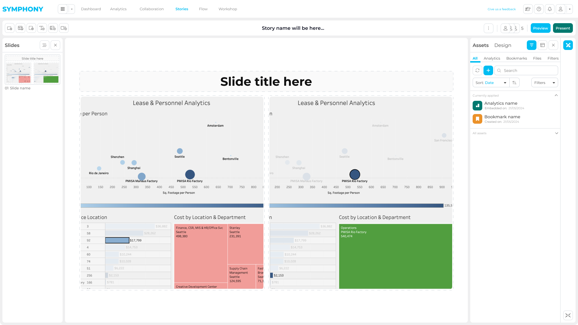
Story Prototype
High-fidelity prototypes used to test storytelling flows, validate edge cases, and gather stakeholder feedback before development.
Apps - Key Modules
The platform was structured around three core modules, each designed to support a specific phase of the data workflow.
The goal was to keep users inside Symphony throughout the entire lifecycle, from analysis, to collaboration, to presentation, without relying on external tools to complete critical tasks.
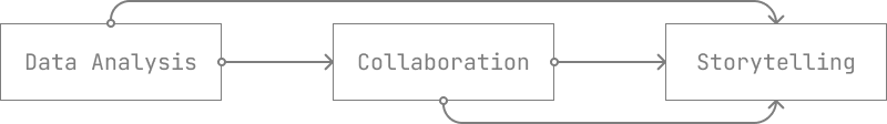
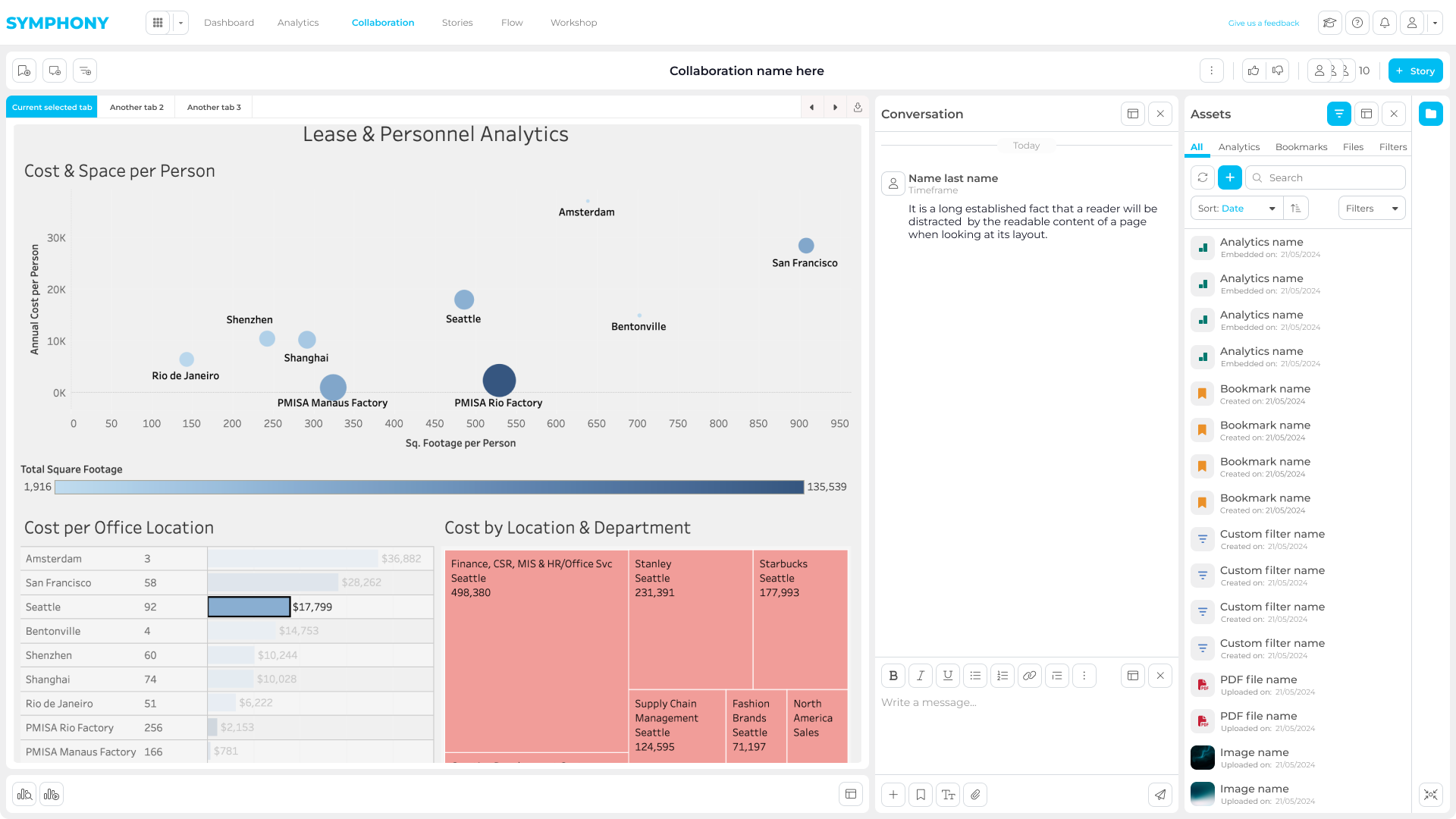
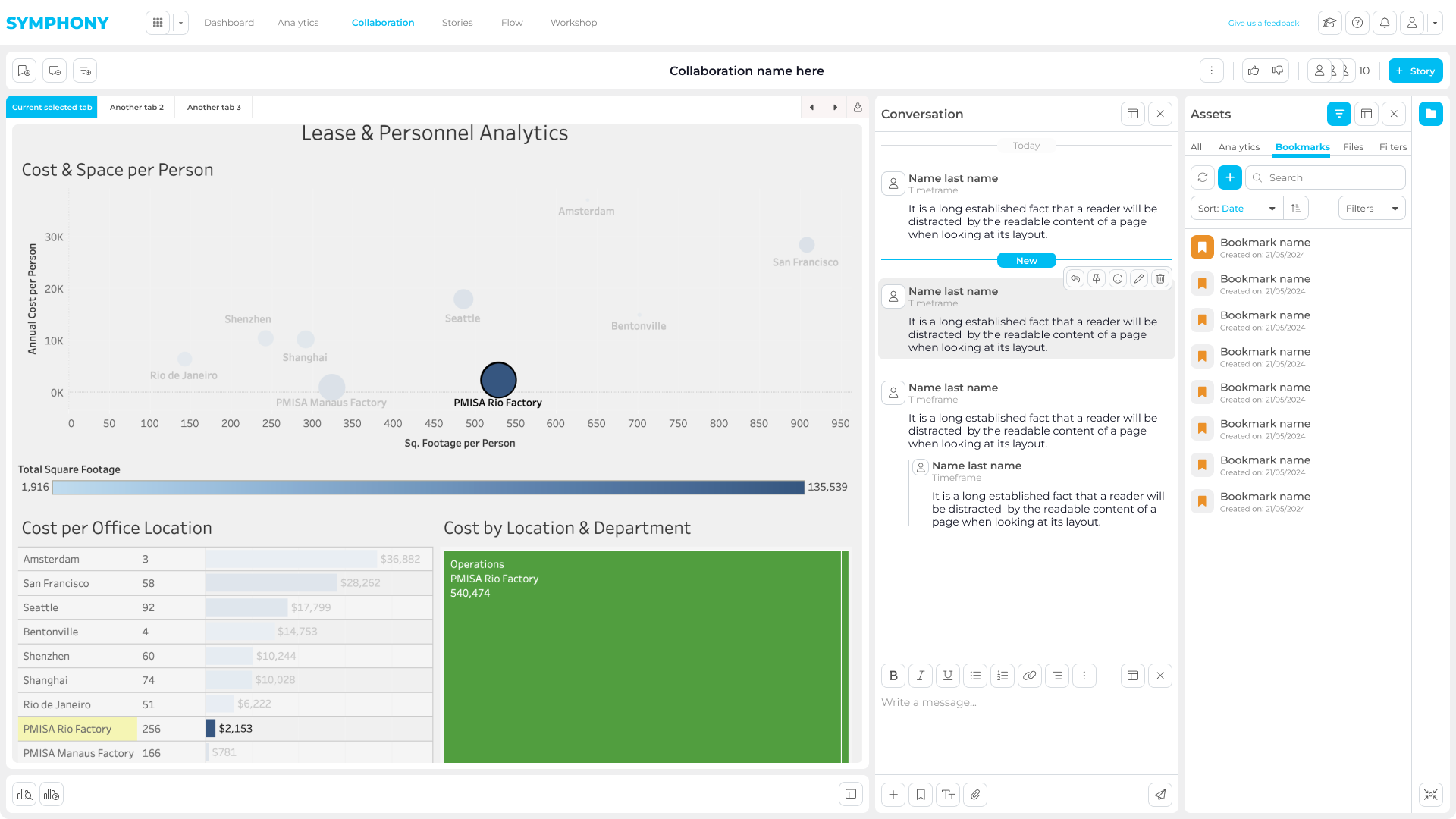
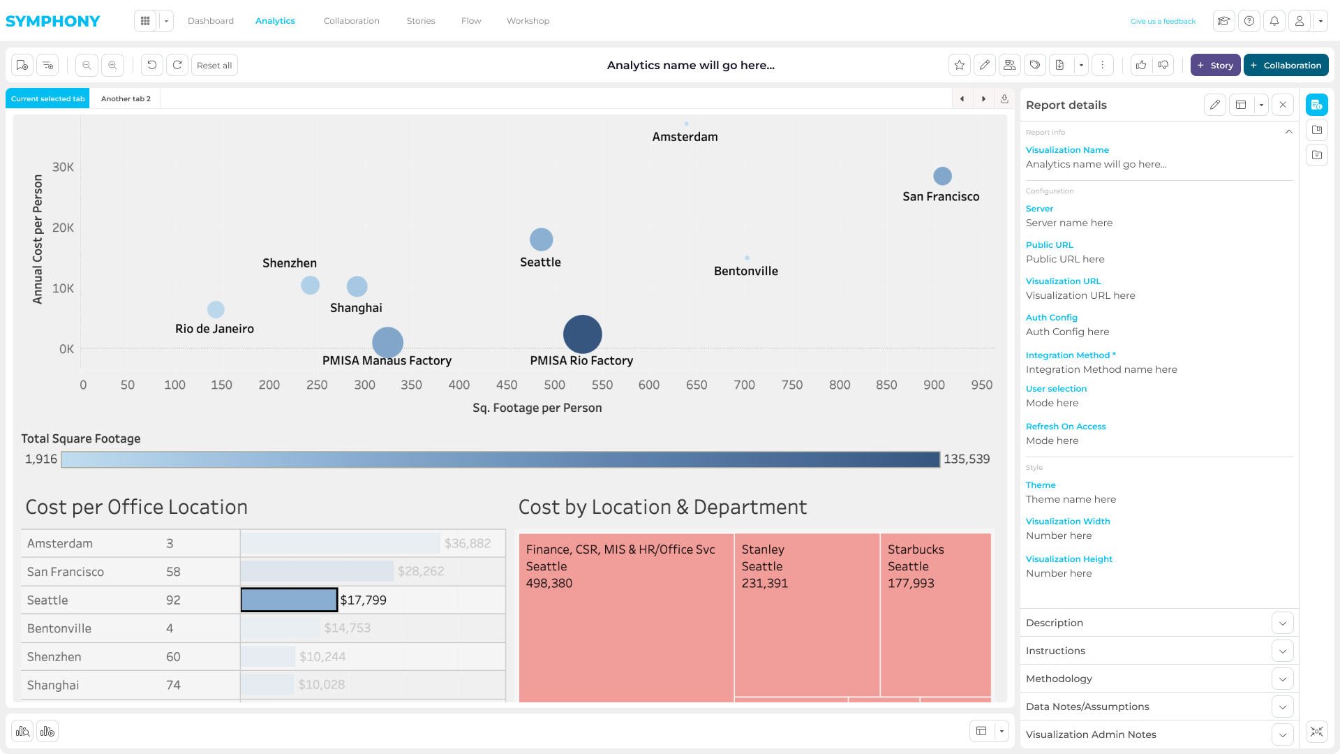
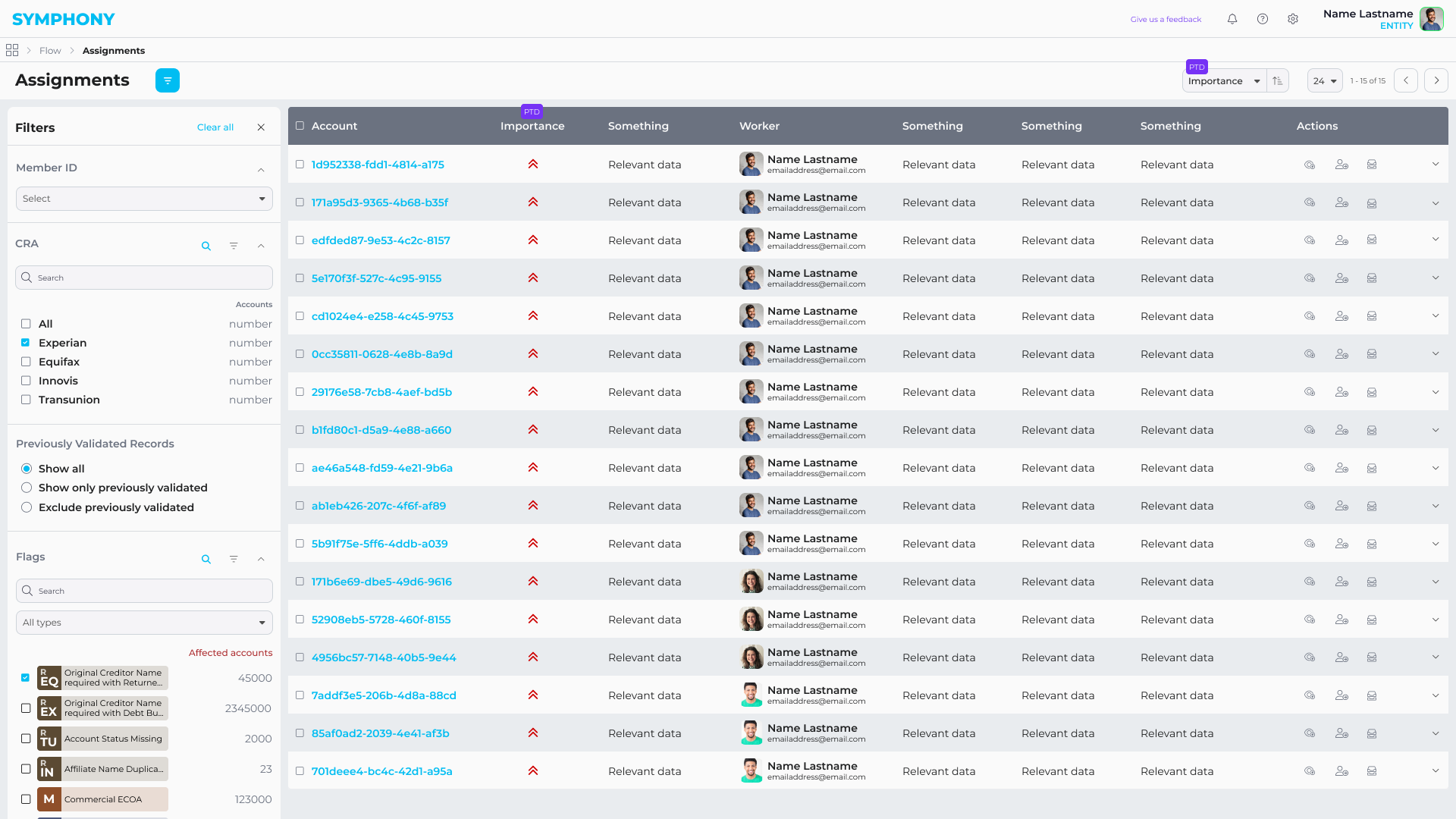
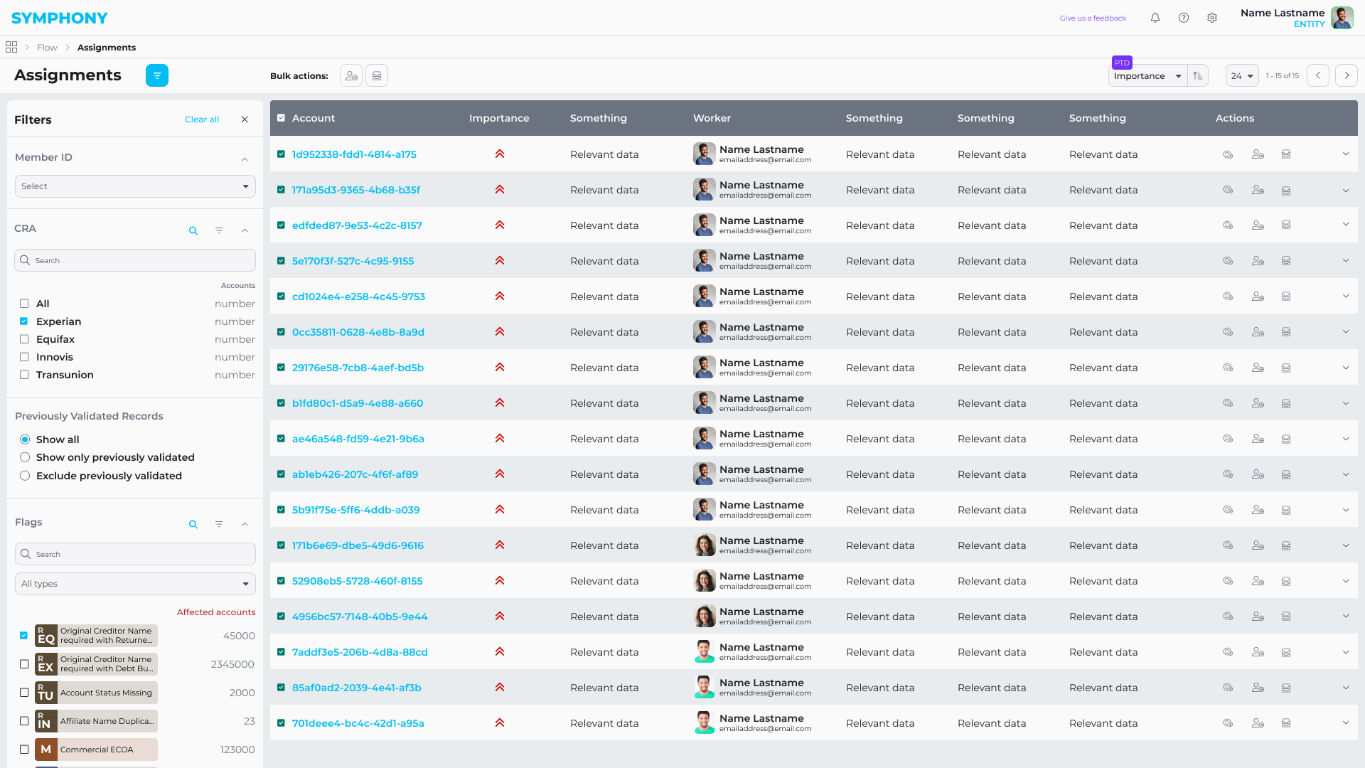
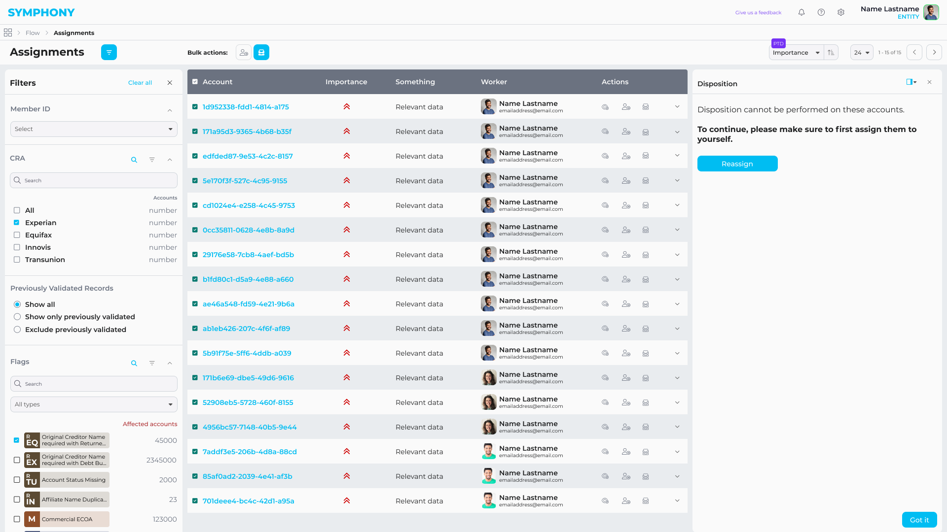
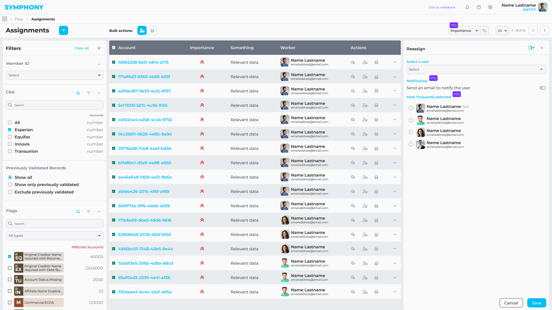
Embedded Analytics
Users can import reports from different data sources through guided, no-code flows.
Once imported, reports can be explored directly within Symphony, enabling teams to analyze data without switching tools or depending on technical support.
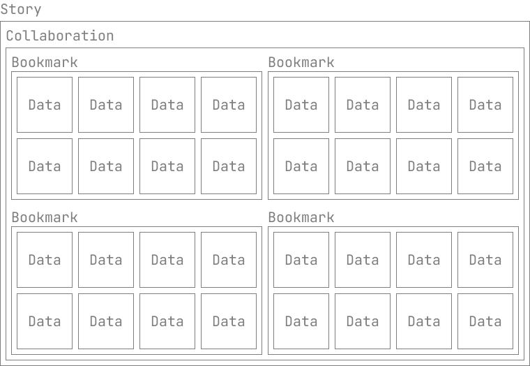
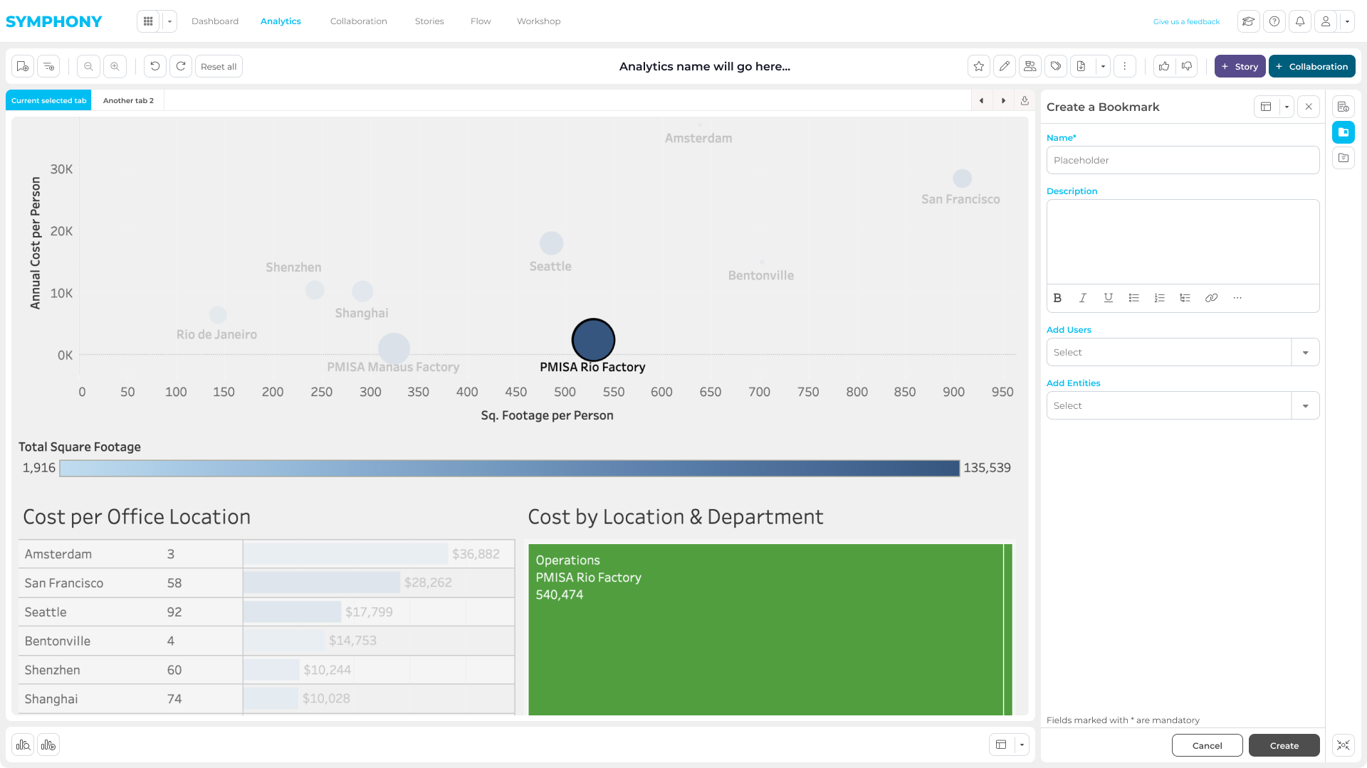
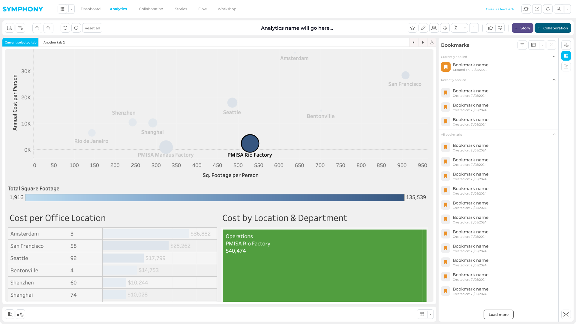
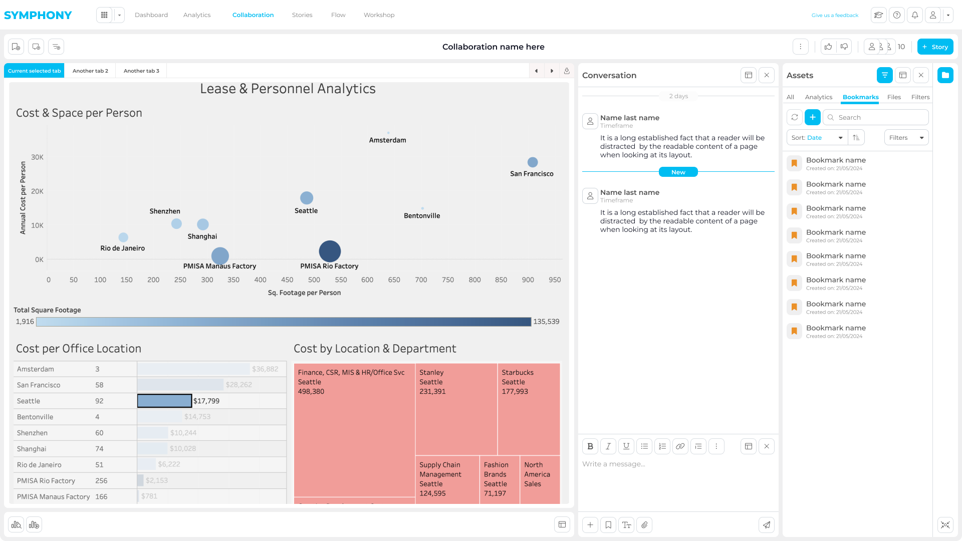
To eliminate the “screenshot workflow”, we introduced Bookmarks: a way to save a precise state of a report (filters, selections, and context). This allowed users to share an exact data view with teammates or external stakeholders, and to start focused collaboration and discussion directly on top of live data.
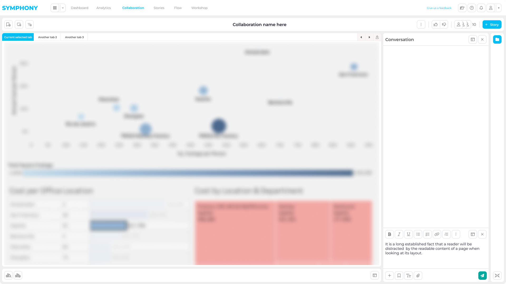
Collaboration Workspace
Symphony provides a shared environment where users can create bookmarks, add annotations, and collaborate with internal or external stakeholders.
This removes the need for fragmented feedback loops across emails or separate tools.
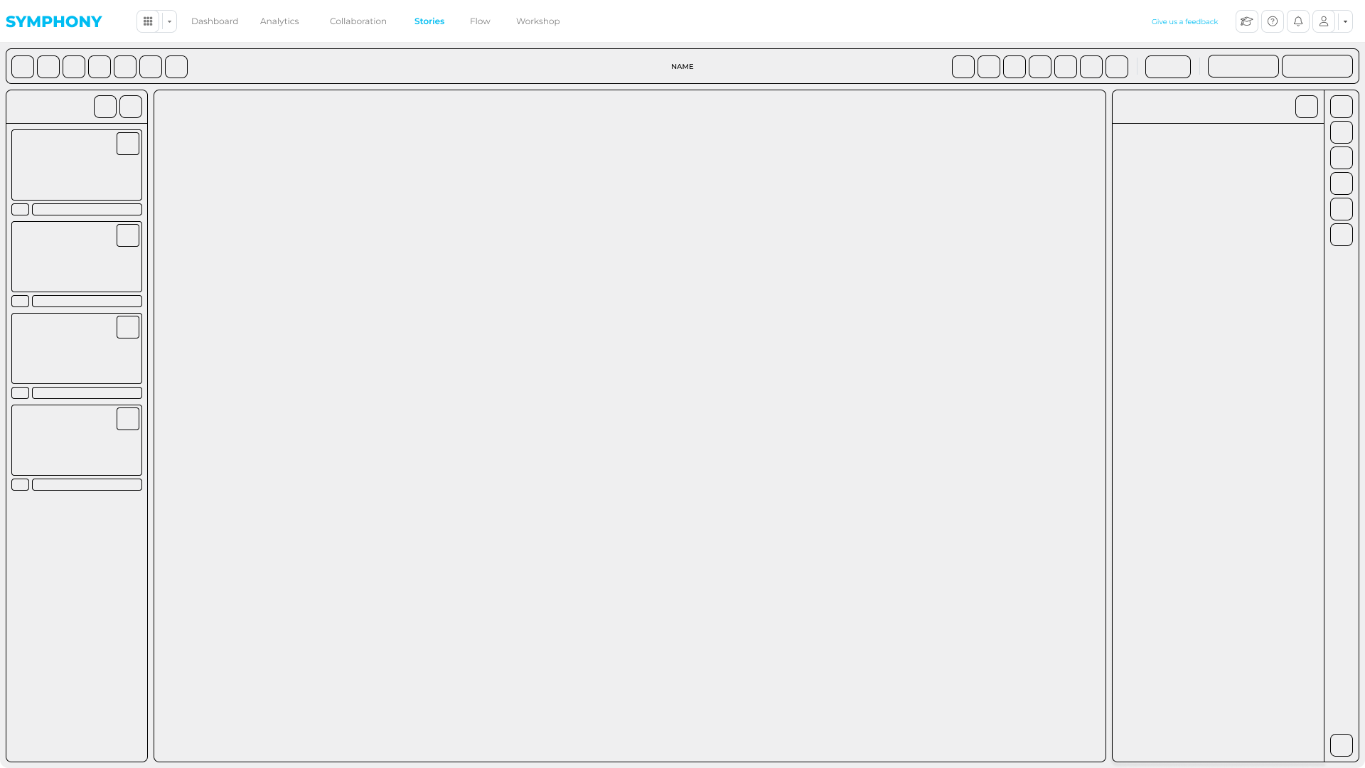
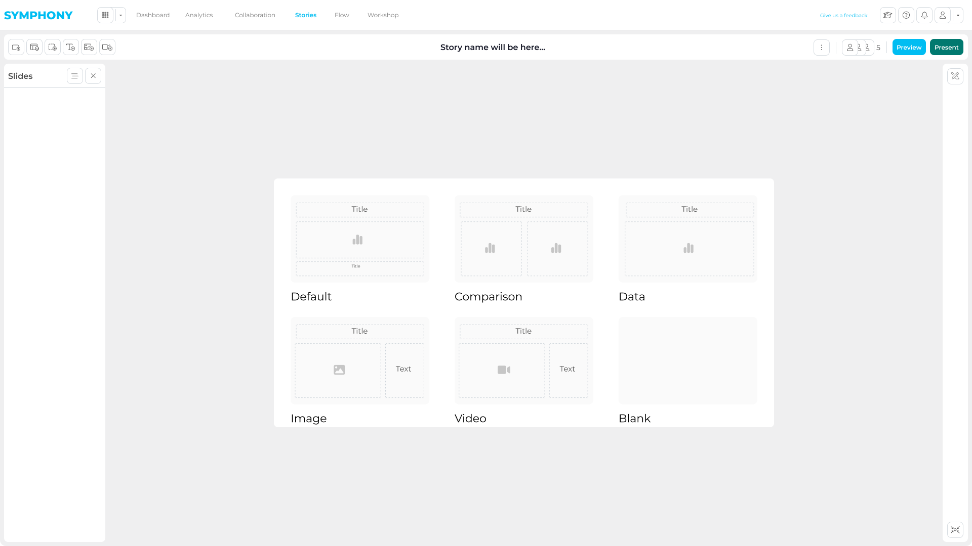
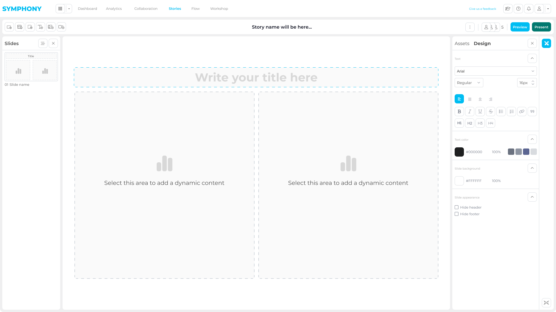
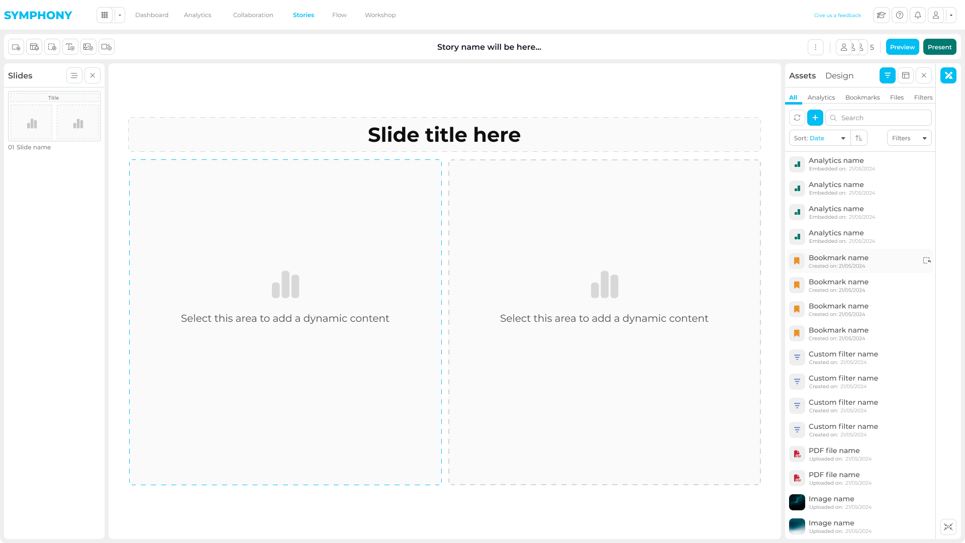
Storytelling
The Story module allows users to transform analysis into structured narratives.
Reports, bookmarks, text, and visuals can be combined into dynamic presentations, enabling teams to deliver clear, client-ready insights without leaving the platform.
Additional apps
As Symphony matured, new client needs led to specialized apps built on the same core platform.
They expanded Symphony into regulated workflows, investigations, and document intelligence, while keeping the shared architecture intact.
Below are a few examples of early GSD prototypes
Flow
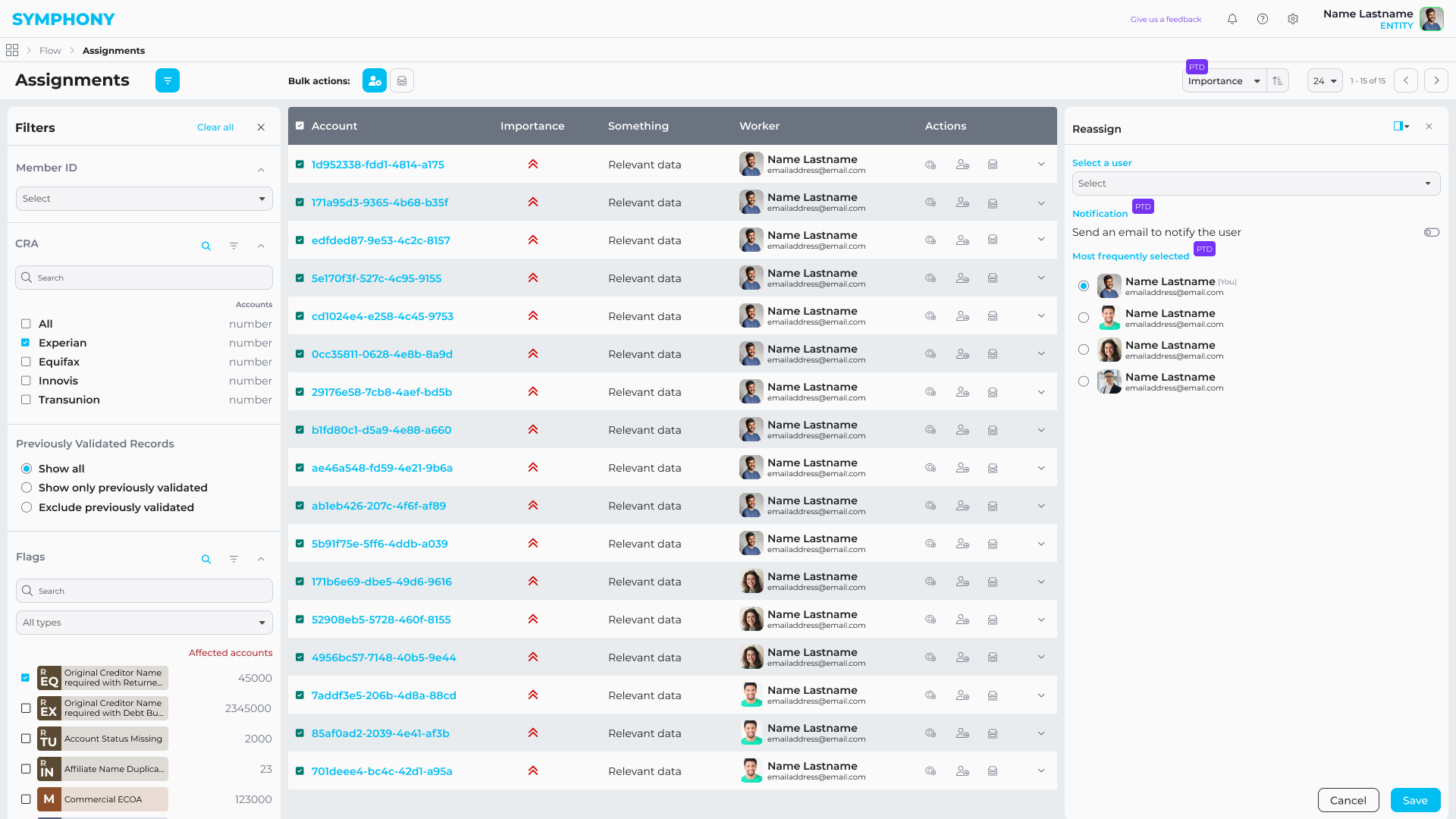
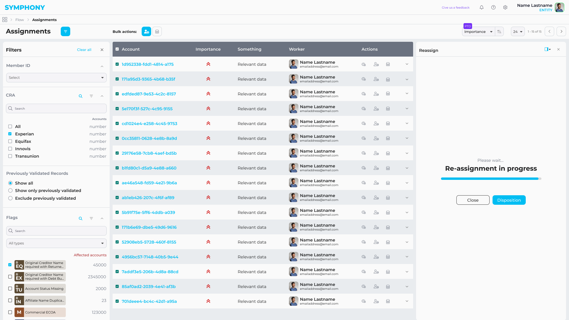
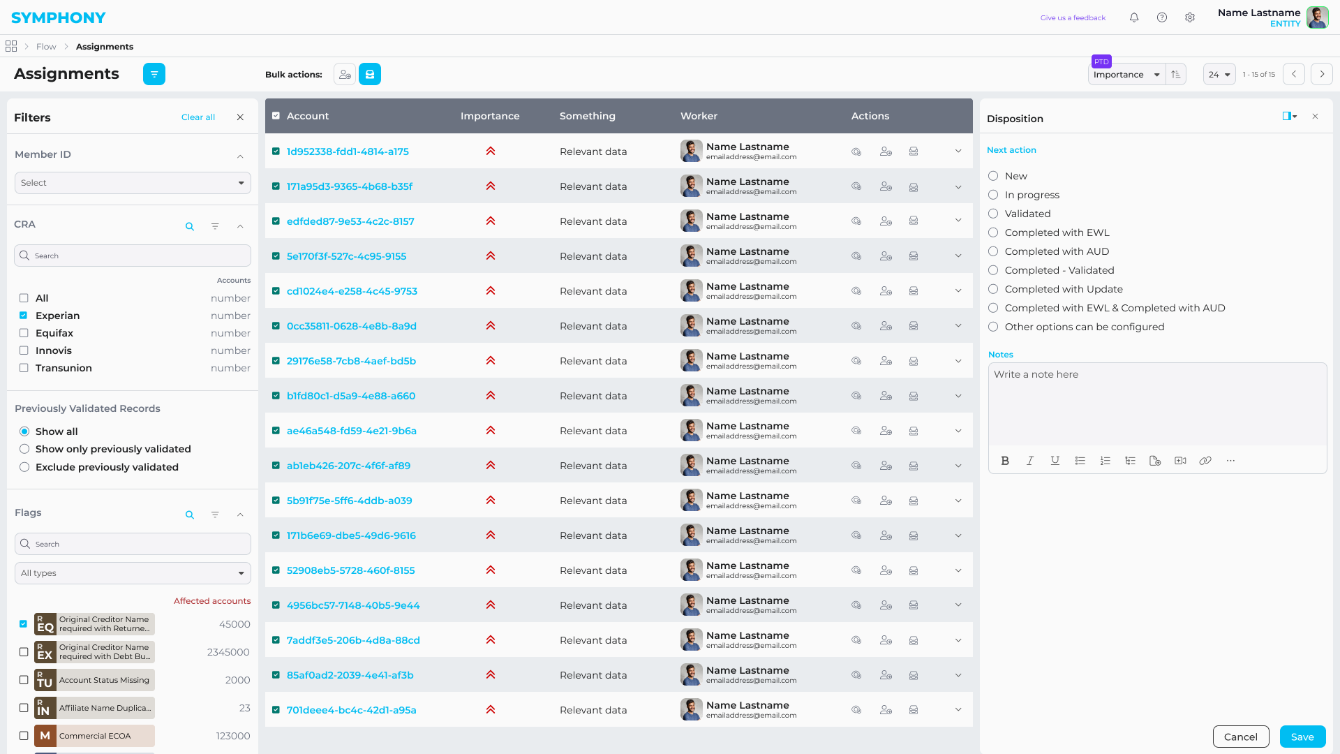
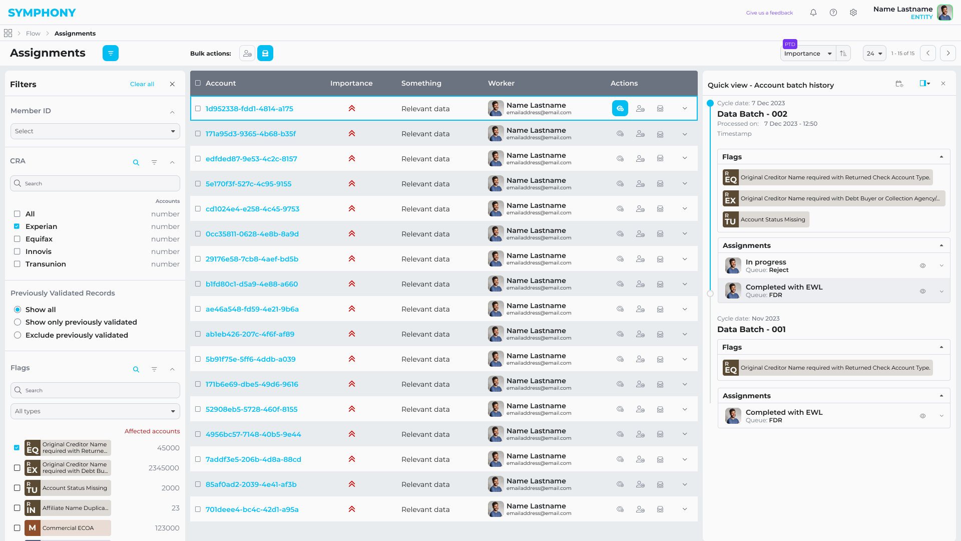
Flow was a specialized analytics and compliance product built inside Symphony for highly regulated, data-intensive workflows.
It unified large-scale data validation, investigation, and remediation into a single auditable system, replacing fragmented spreadsheet-driven processes and enabling teams to move from detection to resolution without leaving the platform.
Core capabilities
- Large-scale data quality analytics and anomaly detection
- Root-cause investigation across reports and customer records
- Risk-based prioritization and remediation workflows
- Role-based access with full audit trails
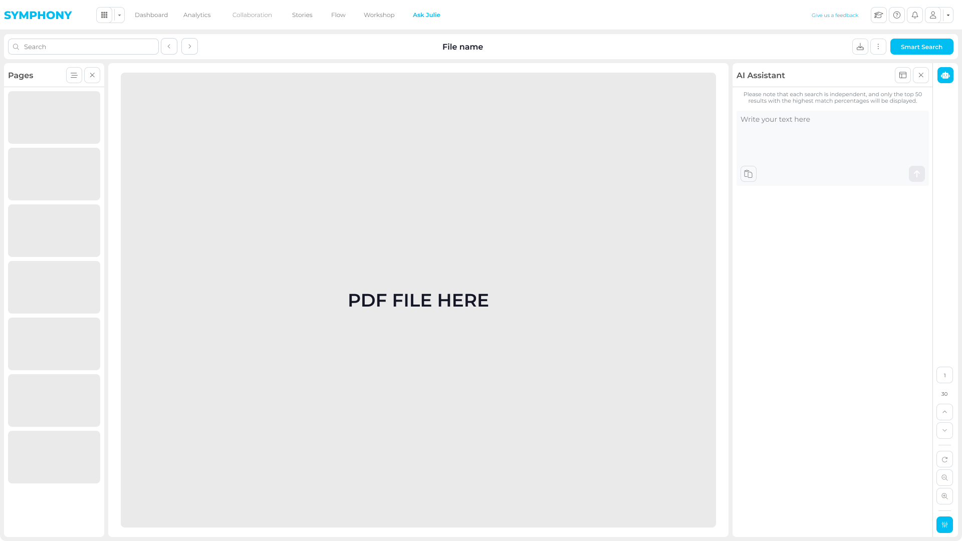
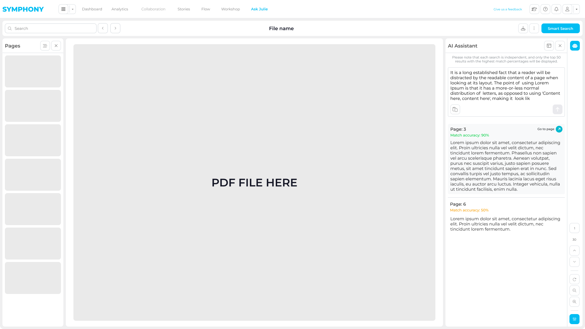
ASK Julie
ASK Julie was an internal AI-powered document analysis tool designed to support teams working with large volumes of unstructured PDF reports in regulated environments.
It turned static documents into a searchable, interactive workspace, helping users locate information faster, validate findings, and significantly reduce manual review time.
Core capabilities
- Semantic search across large PDF libraries
- Confidence indicators to support validation and compliance workflows
- AI-assisted summaries of long and complex documents
Engineering
Symphony was built through close, continuous collaboration between design and engineering.
I worked day to day with back-end engineers and product stakeholders to translate complex analytics requirements into scalable front-end systems.
My role sat between UX, architecture, and implementation — shaping how components, states, and data-driven interactions were designed, documented, and built.
Front-End Architecture
I designed and implemented a large part of the front-end architecture, focusing on reusable components, clear state models, and predictable interaction patterns.
Alongside production code, I created internal front-end documentation to define component behavior, edge cases, and usage guidelines. This helped the team stay aligned as the platform expanded across multiple apps and workflows.
The goal was not just to “build screens”, but to establish a UI foundation that engineering could reliably extend over time.
Enablement & Go-to-Market
As Symphony started to be adopted by enterprise clients, structured documentation became critical.
I designed detailed PDF user manuals used by client teams to onboard employees, standardize workflows, and reduce dependency on live support sessions.
These guides translated complex product features into clear, step-by-step instructions, helping organizations scale usage of the platform across different roles.
Alongside the product work, I also supported go-to-market activities by designing tailored pitch presentations used in client sales pitches and by creating supporting microsites.
What I produced
End-to-end user manuals covering core Symphony workflows
Role-oriented guides for analysts, managers, and operational users
Visual, step-by-step documentation aligned with the live product UI
Materials used by clients for internal training and onboarding
Why it mattered
Improved platform adoption across enterprise teams
Reduced support load and repeated training sessions
Enabled clients to scale Symphony internally with confidence
Outcome & Impact
Symphony was adopted in regulated environments (finance and healthcare) as a secure layer for collaboration and storytelling on top of existing BI tools.
By keeping review, feedback, and narrative in context, teams reduced “deck work”, improved stakeholder alignment, and moved faster from insight to decision.
This enabled enterprise users to work more independently with complex data, while supporting secure sharing with internal and external audiences.
Delivery Impact
Role & Team
60+
Design system components kept aligned across Figma and production
100+
Flows, wireframes, and prototypes produced to de-risk delivery
90%
Improved conversion from demos and prototypes used in sales cycles
60%
Faster delivery through tight collaboration across design and engineering
Platform Impact
Product & Clients
-60%
Reduced time to insight across analysis, review, and collaboration
30%
Faster creation of client-ready narratives directly inside the platform
5M+
Daily records analyzed across enterprise-scale finance datasets
60%
Improved operational efficiency through data-led process optimization
Impact came from treating the UI as a system: aligning complex workflows to a component-based architecture and validating end-to-end journeys early.
A consistent design system reduced UI fragmentation and sped up delivery, while automation enabled analysis at scale compared to manual review in small batches.